
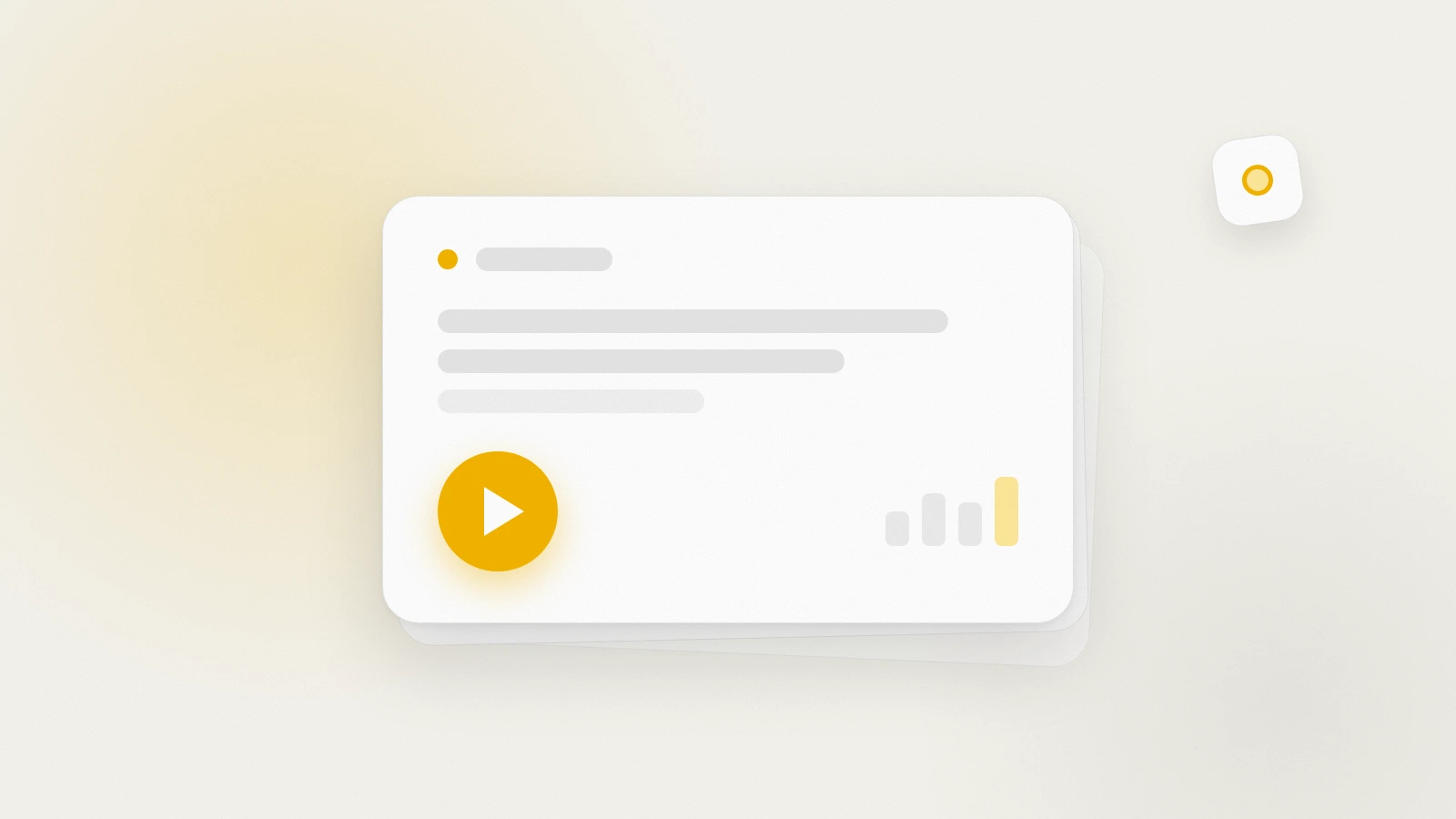
What's New: release notes, right inside MemoForge
MemoForge now keeps a What's New panel: every meaningful release lands as one short item with a one-line summary, an optional clip, and an unread dot that clears when you open it.
Table of Contents
Changelogs are where product updates go to be ignored. Ours had the same problem: a page you had to remember to visit, written for people who already knew what had changed.
So the updates now come to you. A What's New list lives inside the app, next to your dashboard, and it holds one short item per release: what changed, one line on what it means for your studying, and — when the change is visual enough to show — a twenty-second clip of the thing doing its job.
The dot that knows what you have seen
Each item carries a small New marker until you open it. The marker is stored per account, so it follows you between your laptop and your phone, and it clears the moment you read the item or play its clip. The sidebar entry shows a count, and the dashboard shows one compact line pointing at the newest unread item — one line, at the top of your day, not a modal in your way.
Nothing is marked read for you. A badge that clears itself teaches you to ignore badges.
What actually earns an item
The list is deliberately short, and that is a product decision rather than an engineering limitation. Internal work does not get an item: deploy chores, dependency bumps, test refactors, monitor tweaks. What ships is filtered down to changes you can see or feel in the app, and several pull requests that add up to one feature become one item rather than four. There is a hard ceiling of three items a day, and a day with nothing worth announcing stays silent.
The practical effect: if it is in the list, something in the app changed for you.
Why some items have a video
Two of the last few releases — the daily goal ring in the study header, and the XP and level-up moment at the end of a session — are easy to describe and hard to picture. Those get a short clip, recorded from the real interface rather than a mockup, with the mobile layout magnified so the numbers are actually legible at video size.
Everything else arrives as text and a hero image, because a video nobody needs is worse than a paragraph that answers the question.
Where to find it
What's New sits in the app navigation. The dashboard shows the newest unread item until you open it, and the full list lives at its own page, newest first, with a "mark all as read" for when you have been away.
If you would rather not see it at all, you can dismiss the dashboard line — the list itself stays in the navigation, out of the way, waiting for the next release.
That is the whole idea: fewer, better announcements, in the place you already are.
Need help turning messy notes into clean flashcards?
MemoForge turns PDFs and public URLs into AI-generated flashcards that you can review before exporting to Anki.
Related Articles

Create Flashcards from Any Webpage: Turn Articles into Study Material
Convert web articles, documentation, tutorials, and research papers into structured flashcards. Learn how to extract knowledge from any public URL with AI-powered flashcard generation.

Turn YouTube Videos into Flashcards: Learn from Any Video with AI
Transform educational YouTube videos into study-ready flashcards. Learn vocabulary, concepts, and key insights from lectures, tutorials, and language content automatically.
Can Claude Make Anki Cards? A Workflow Guide
Can Claude and ChatGPT make Anki cards? Use prompts for focused output, compare both tools on the same source, and check every answer before importing.